SCHMOOZE: MATCHMAKING DONE RIGHT
Schmooze is a dating app that matches users based on their meme preferences, moving away from traditional swiping methods. The core challenge: a casual product perception was attracting users with misaligned intent, causing friction in real matchmaking flows.
“Initial interactions revealed users were treating it as a social playground. We needed to redesign the experience to communicate serious dating intent without sacrificing the brand's playful core.”
TL;DR
- 01Identified misaligned user intent through in-depth interviews and observation sessions.
- 02Separated meme browsing from profile swiping into distinct intention-based flows.
- 03Redesigned UI language to balance playfulness with the gravitas of dating apps like Hinge.
01 User Research & The Opportunity
A multi-faceted research approach was employed to understand user perceptions of Schmooze and identify barriers hindering a smooth user experience.
Competitive Audit
Analyzed how Schmooze's features and interface compared to other popular dating apps, noting Schmooze's distinct casual and 'funky' design language.
Participant Observation
Used the app firsthand to understand the user flow and initial interactions — surfacing friction that users themselves couldn't articulate.
User Interviews
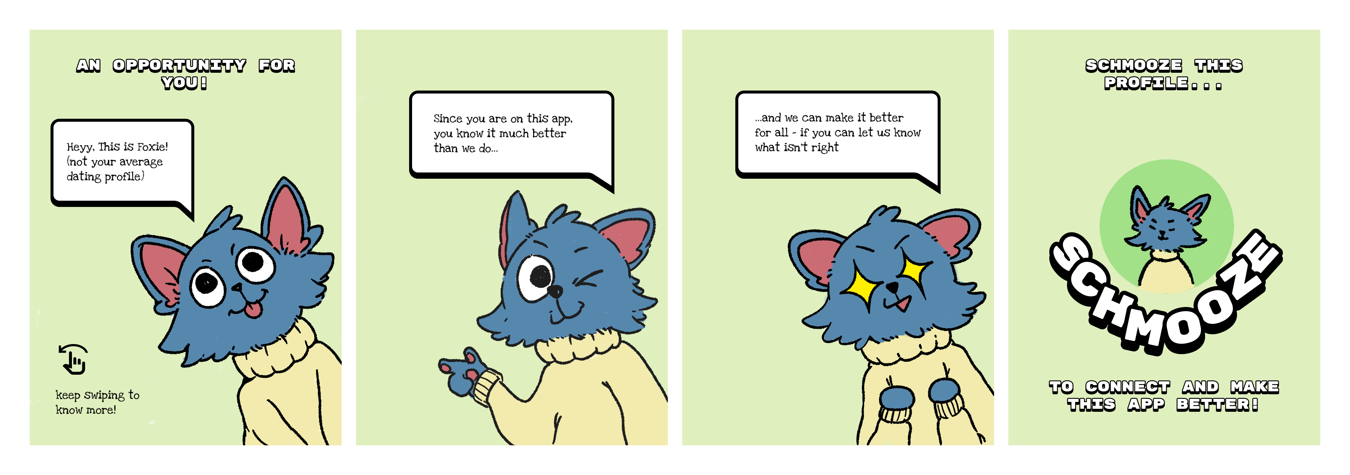
Directly engaged with users on the app. Initial sessions were hesitant — researcher profiles were redesigned to be more welcoming, which successfully encouraged participation.
Aligning meme consumption with the intent to foster real dating connections.
A critical subset of the user base viewed Schmooze as a pure meme platform, with no awareness or intent toward dating.
Research Insight
"Users weren't swiping to match — they were swiping to react. The meme format had inadvertently become the destination, not the vehicle."
02 Problem Statement & Friction
The research surfaced severe misalignment in perception and behavior across the user base. Three core friction points emerged from usability testing.
Mindless Swiping
Users often swiped through memes and profiles without careful consideration, leading to matches lacking genuine connection. Some seemed desperate to interact, regardless of match quality.
Fluctuating User Intent
Users' primary interest in the app varied — some were focused on memes, while their desire for dating fluctuated over time.
Misaligned Perceptions
Due to its casual branding, many users viewed Schmooze more as a general socializing app — attracting users not seeking romantic connections, including some just looking to socialize.
Chat Initiation Hurdles
Users found it difficult to start conversations with matches, often missing opportunities for meaningful interaction — no icebreaker architecture existed in the product.
Technical Glitches
Frequent technical bugs, particularly within the chat system, frustrated users and sometimes led them to abandon the app entirely.
03 Architecting Design Solutions
Based on the research insights, three design solutions were proposed.
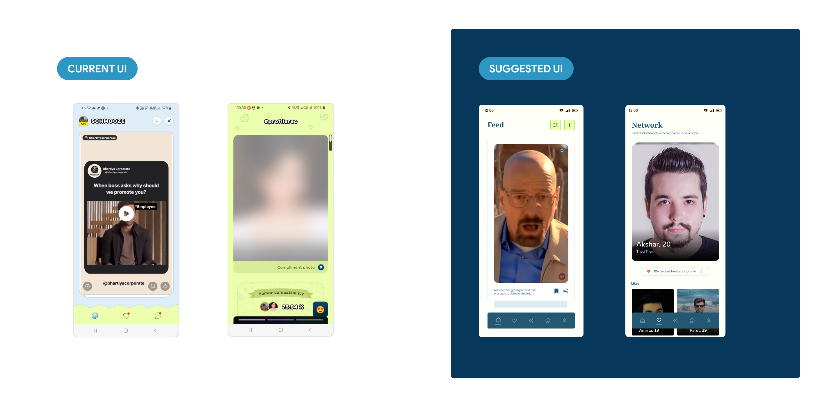
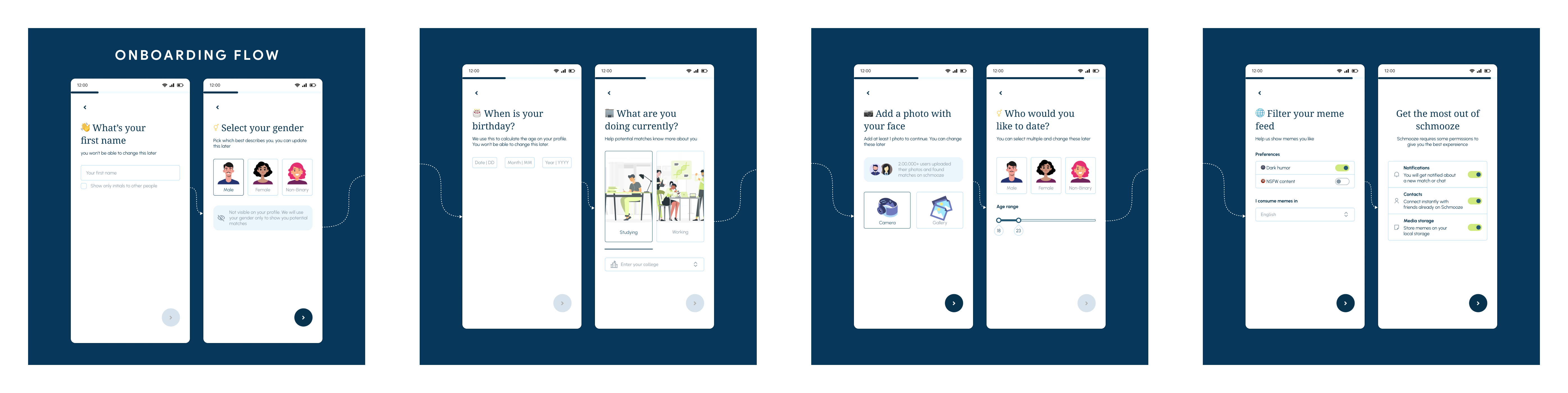
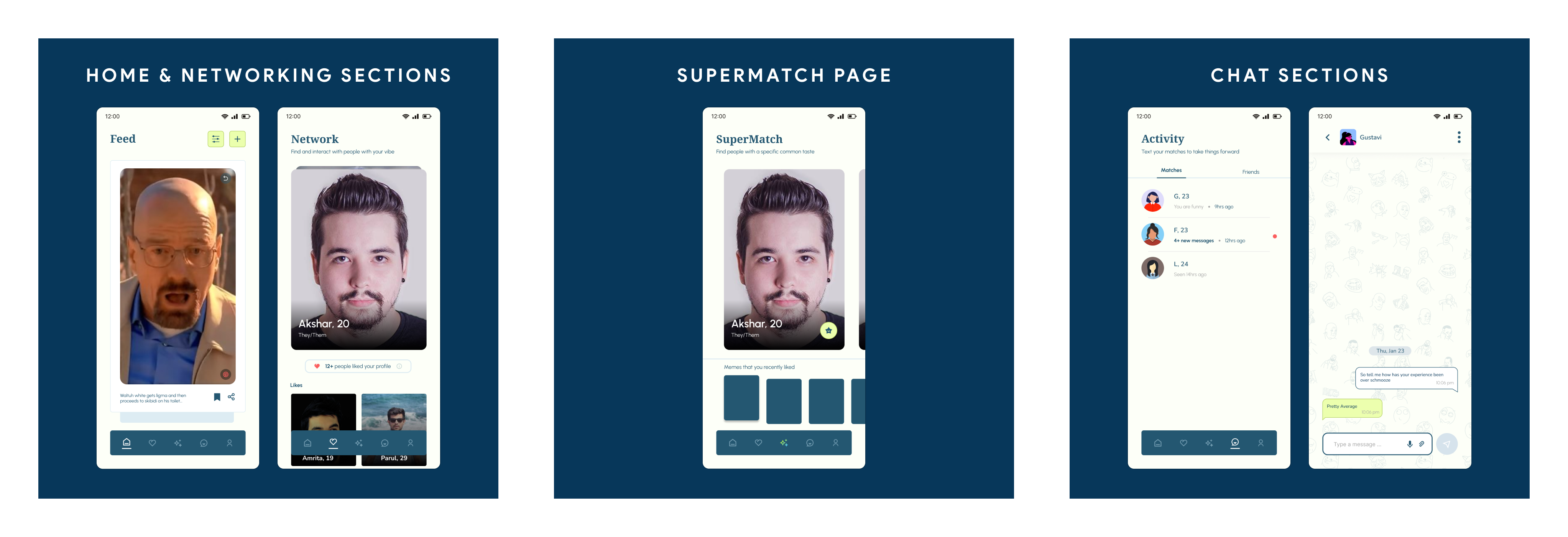
Solution #1 — Separate Tabs for Memes and Profiles
To help users differentiate between browsing content (memes) and evaluating potential matches (profiles), distinct tabs were introduced. This aimed to make users more mindful during profile swiping.
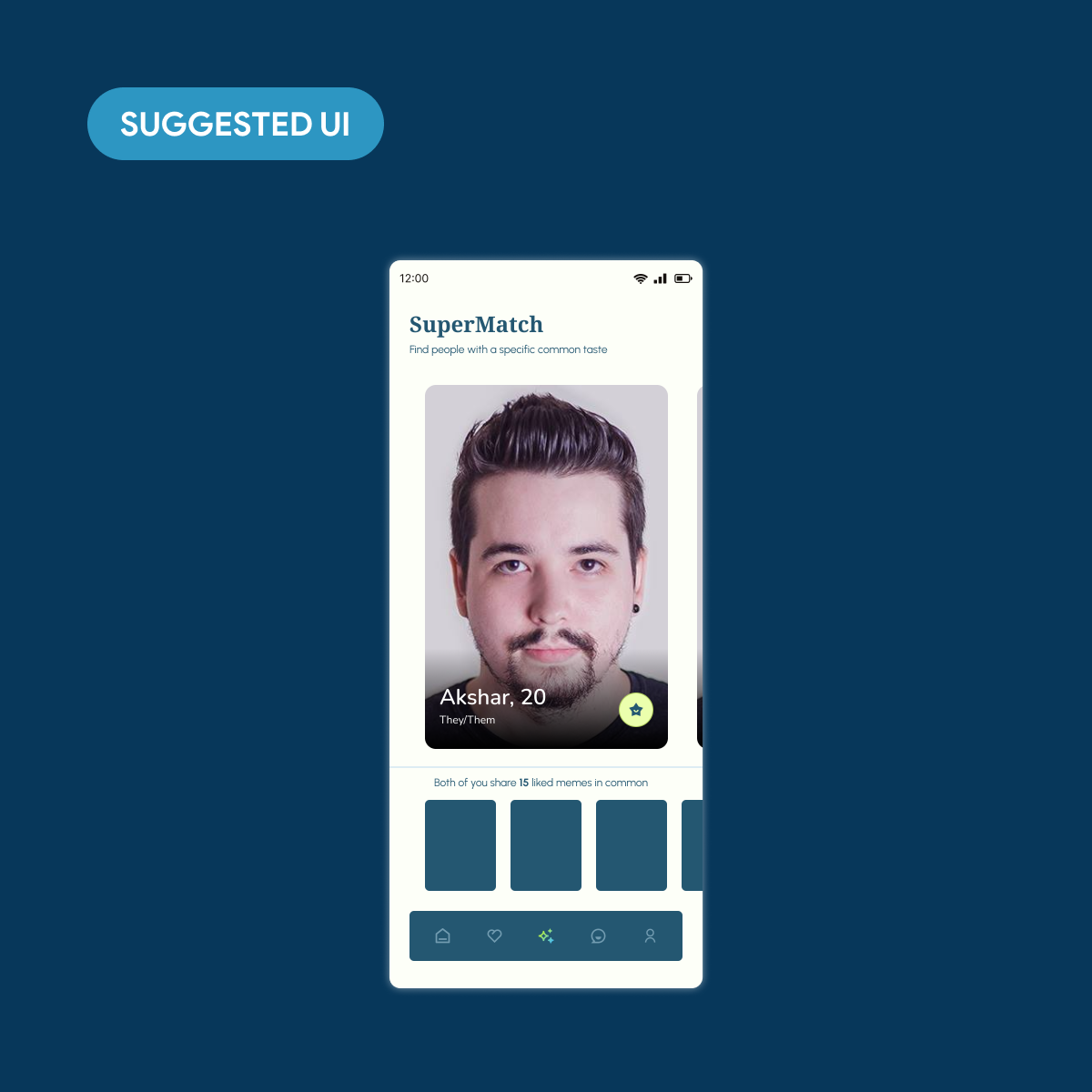
Solution #2 — Enhanced Profile Discovery
For users wanting more control over matching beyond the algorithm, a new tab was proposed allowing them to find others who liked the same specific memes.
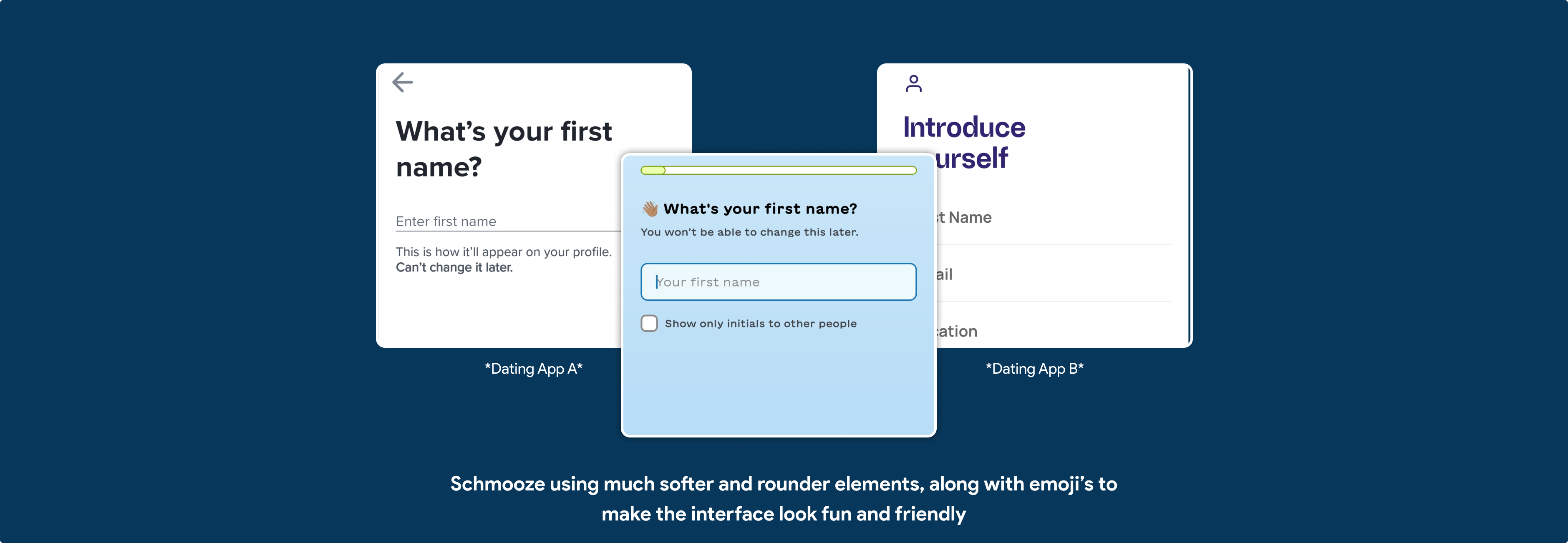
Solution #3 — Refining the UI Language
To more clearly communicate Schmooze's intent as a dating platform, the design language was refined to balance the fun elements with a more elegant, serious aesthetic, akin to other dating apps.
Playful, But Purposeful
The UI language needed to walk a tightrope — fun enough to retain the meme DNA, serious enough to attract genuine daters.
Single Unified Feed
Blended meme reactions and dating swipes in a single feed. Users couldn't distinguish between content engagement and romantic interest — match rates were low.
05 Better Matchmaking Experience
By understanding user behaviors and perceptions through research, key pain points like mindless swiping, unclear app intent, and interaction difficulties were identified.
The proposed design solutions — introducing distinct tabs, offering tailored profile discovery, and refining the UI's visual language — aim to create a more intentional, effective, and satisfying dating experience on Schmooze.
Outcome
"Clarity of intent is the foundation of connection. By separating casual meme browsing from intentional dating flows, Schmooze gained the design credibility it needed to retain users who genuinely wanted to match."
Clarity of intent is the foundation of connection.
By separating casual meme browsing from intentional dating flows, Schmooze gained the design credibility it needed to retain users who genuinely wanted to match.